Jemma Bag
Services
UI/UX
E-commerce website
Digital Marketing
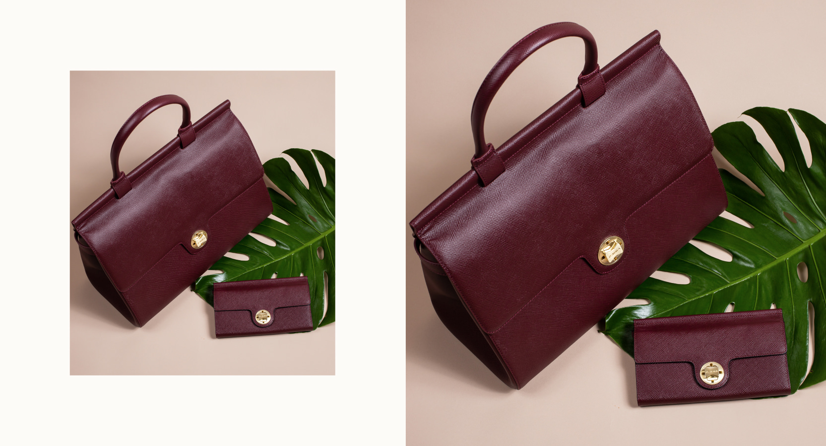
Jemma bag is a luxury brand that designs stylish and functional handbags for working professionals women. We overhauled Jemma’s website by designing a premium shopping experience. visit website
Bags from the office to the gym
Jemma aims at redifining what a handbag should be by designing bags that will fit every moment of the day. To improve the user’s experience, we focused on redesigning their entire site on Shopify.
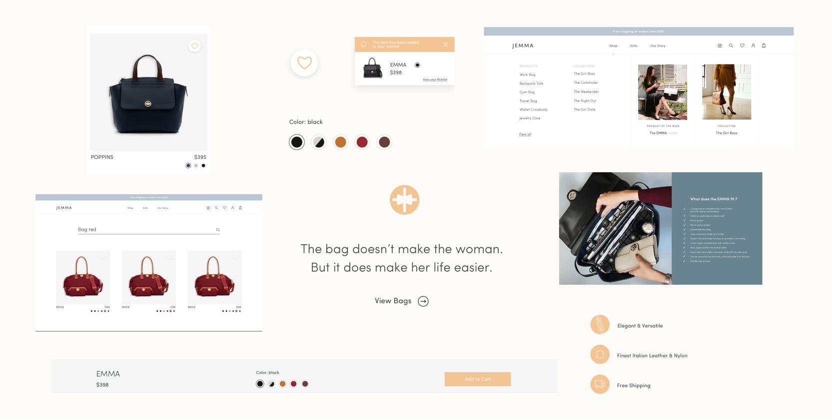
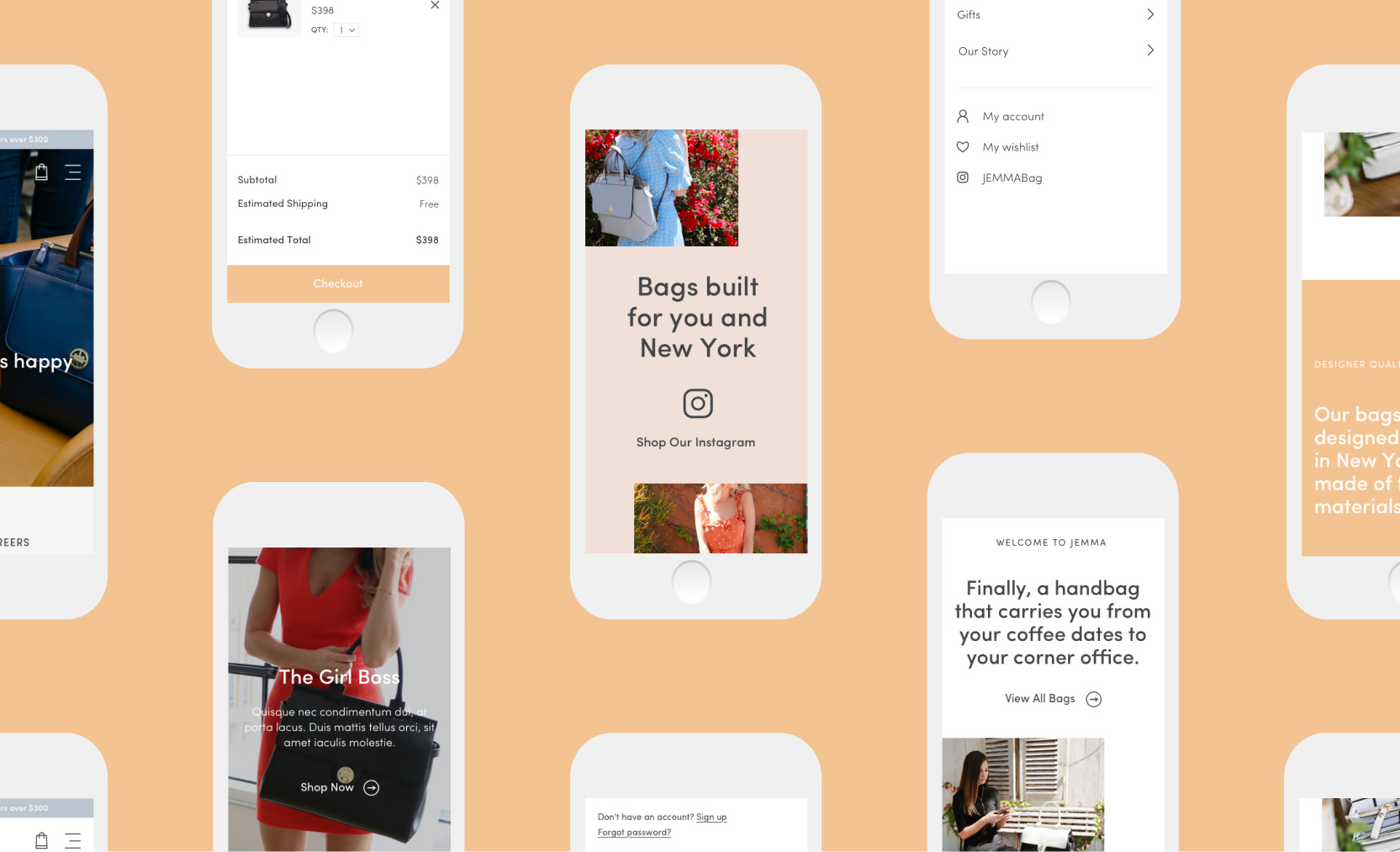
We started by creating a styleguide and various UI elements such as product cards, navigation, color swatch, fixed product bar, notification wishlist pop-up, dynamic search and a new specific iconography.
A refreshed user journey
As consumers are most prone to purchase for bag type, we used product categories and recommendations as a launchpad. The navigation menu operates as a drop-down overlay that showcases every product type for ease of use including a product and collection of the week.
On the homepage, we designed the user journey to show Jemma’s bags can suit every women in every moment of their day: from the gym to the office to a night out.
Product first
The product page is built of a large central image and all the information the user needs for the purchase (reviews, price, color, add to cart). We chose to place these details above the fold to encourage the checkout.
The bags are multi-purpose and we highlighted that with videos and slideshows of its many uses. One important section is the “what does it fit” to show how practical these bags are for the modern woman.
We thought of adding other important features:
+ Multiple angles of the product
+ Color Swatch Toggle
+ Material, Sizing, and Design Description
+ User Reviews
+ Instagram Feature
+ Product Cross-Sells

A new shareable Collection page
Jemma’s low product count gave us the perfect opportunity to showcase all of their bag styles on a single page. The custom collection page features lifestyle photography, wide-set feature images, and acts as a gateway for each individual product collection. Think of it as the most shareable page on the site.
Digital marketing
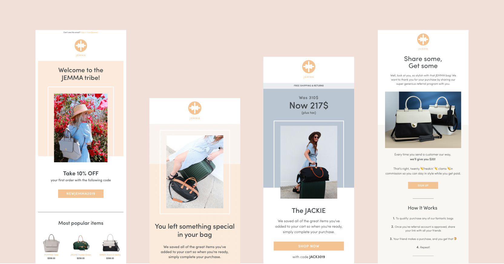
We put together an automated welcome series flow, abandoned cart series and a reward campaign optimized for conversions.
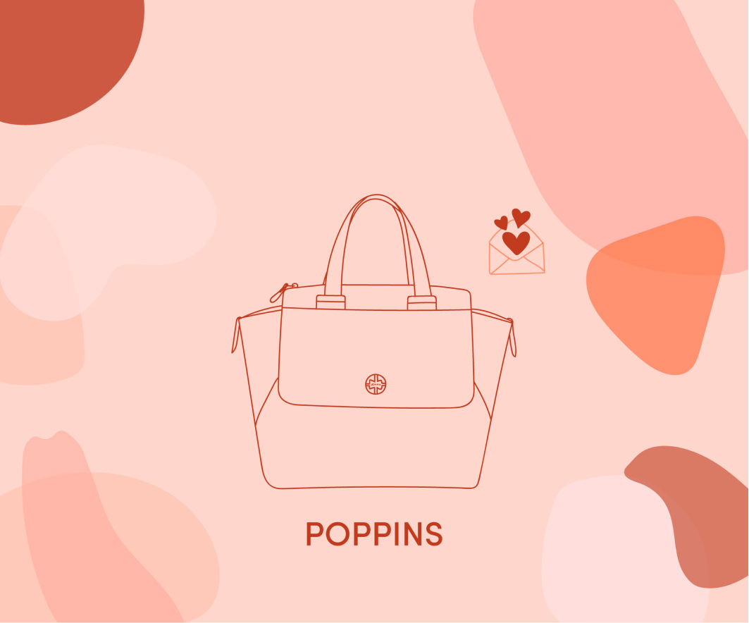
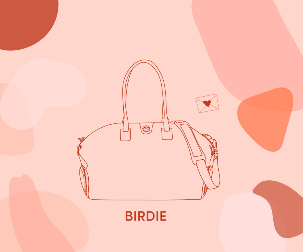
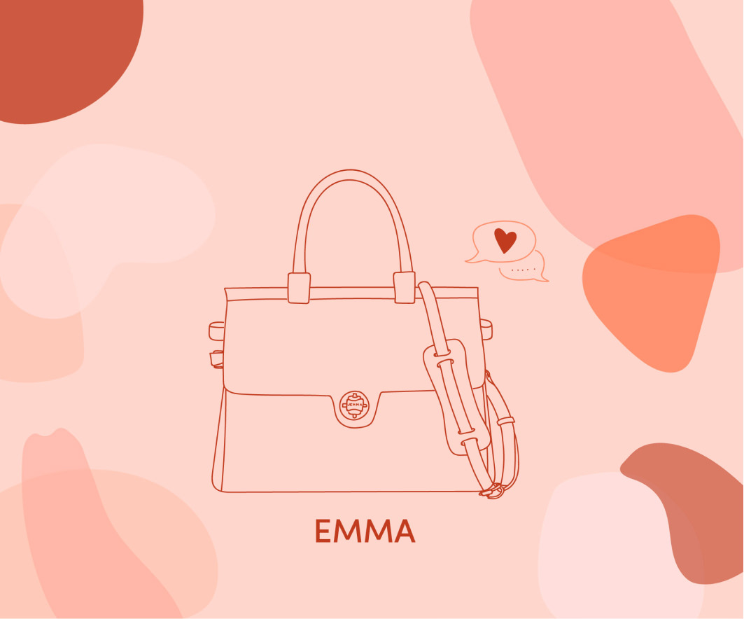
We also created email campaigns for sales or special event like valentine’s day. The launch of new products needed also a specific campaign. Usually built with 3 emails, the first two are a teasing of the new product leading to a landing page to get early access to this new product.
+ welcome series
+ abandoned cart series
+ reward campaign
+ sale/new product campaign
+ welcome pop up
