LIT Boutique

Services
UI/UX
E-commerce website
Digital Marketing
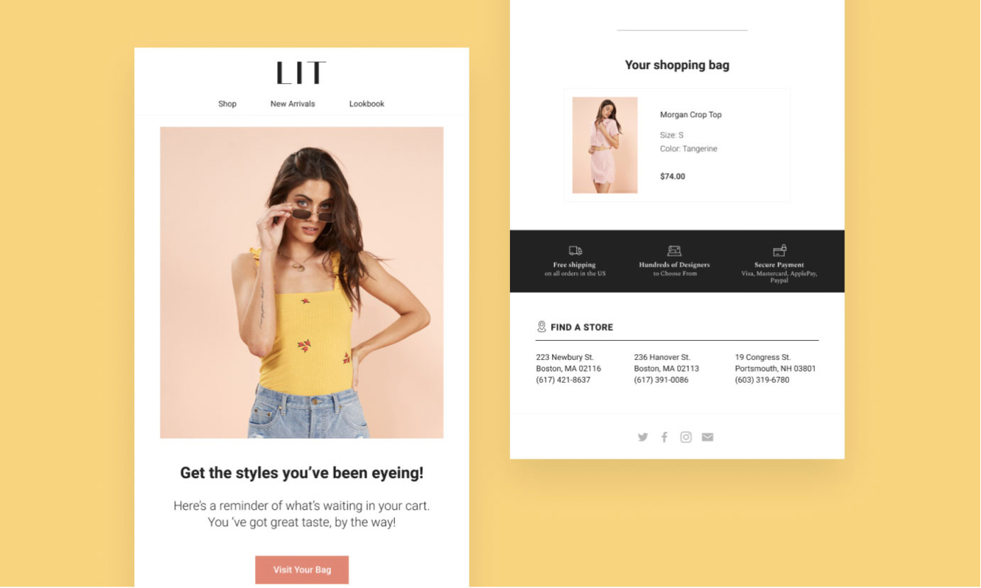
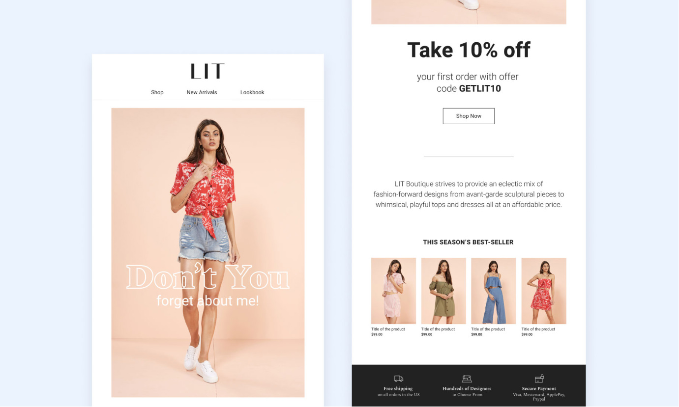
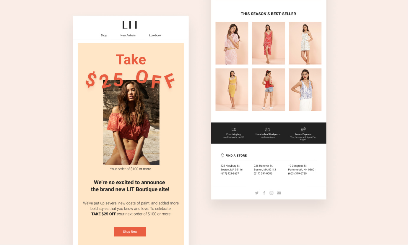
LIT Boutique is a women's clothing store for the chic & sophisticated. We redesigned the main pages of their website and built their email system from scratch. visit website
Redesigning the website
Born in Boston in 2005, LIT Boutique offers an eclectic mix of fashion-forward designs for the modern urban woman at an affordable price.
LIT Boutique asked us to improve their website as they wanted it to convert more. Our goal was to optimize and improve their former website to achieve the best user experience possible.

A MODULAR HOMEPAGE & ORGANIZED NAVIGATION
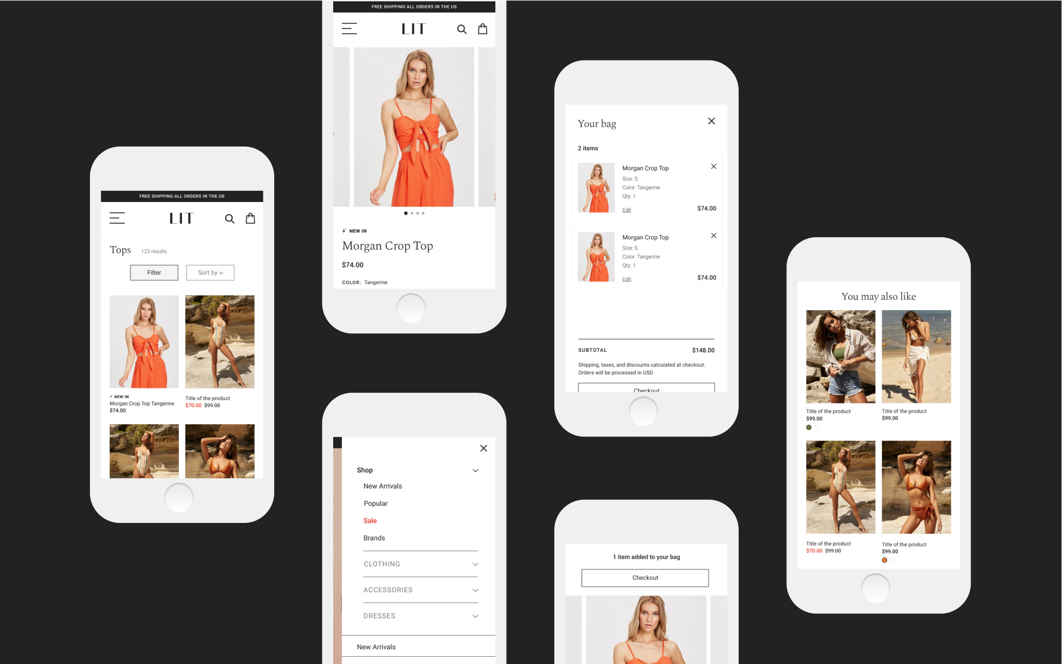
One of the main challenges we faced was optimizing the navigation. To make it clearer, we reorganized the main menu by clothes and accessories then added the possibility to highlight a category depending on the season.
We created several modules on the homepage so the user can access product and collection pages. LIT Boutique having new arrivals every week, we decided to emphasize it in the navigation and to create its own module in the homepage.
A MORE SHOPPABLE COLLECTION PAGE
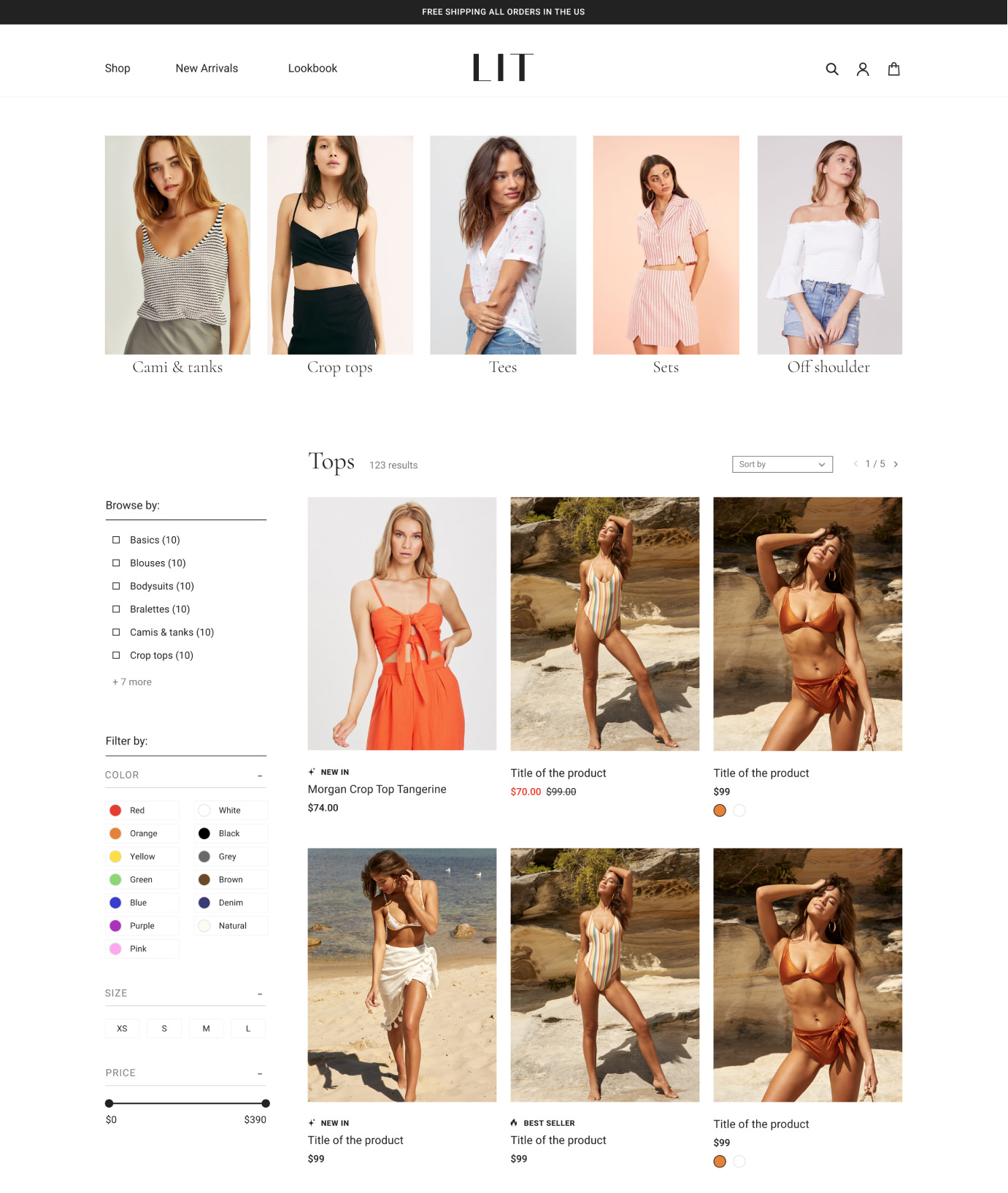
As our goal was to make it more shoppable, we redesigned the collection page by adding sub-categories modules which allows the user to sort through product categories in a more efficient way.
To simplify product searches, we also focused on:
+ filter on the left fixed throughout the scroll
+ color switch on product card
+ tags on product: New in, Best seller, etc.
A MULTI-FEATURE PRODUCT PAGE
For the shopping experience to be at its best, it is fundamental to give the user all the information they need to buy products. We created various features to achieve this goal:
+ various product photos
+ size guide
+ materials and designer details
+ shipping and return methods
+ share product on social media
+ “you may also like”
+ add to cart pop-up
