Soma water
Services
Art Direction
UI/UX
E-commerce website
Digital Marketing
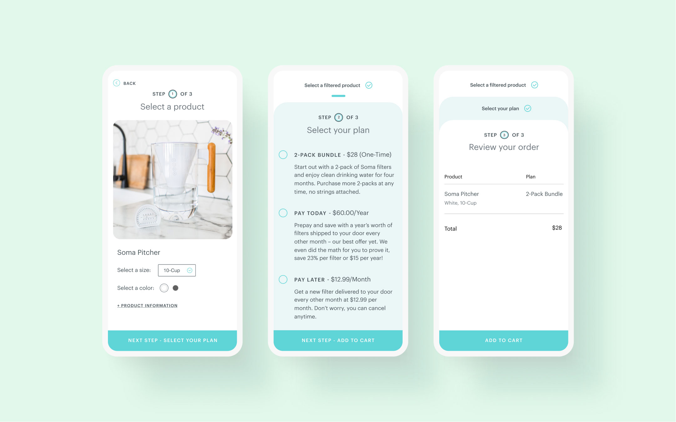
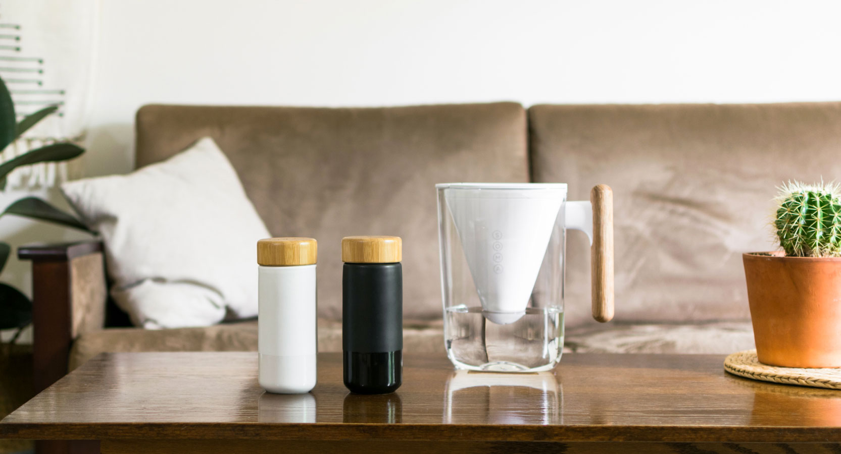
Soma water designs eco-friendly water filtration products. Beyond the redesign of their eCommerce website, we helped build a new experience around water filtration subscription. visit website
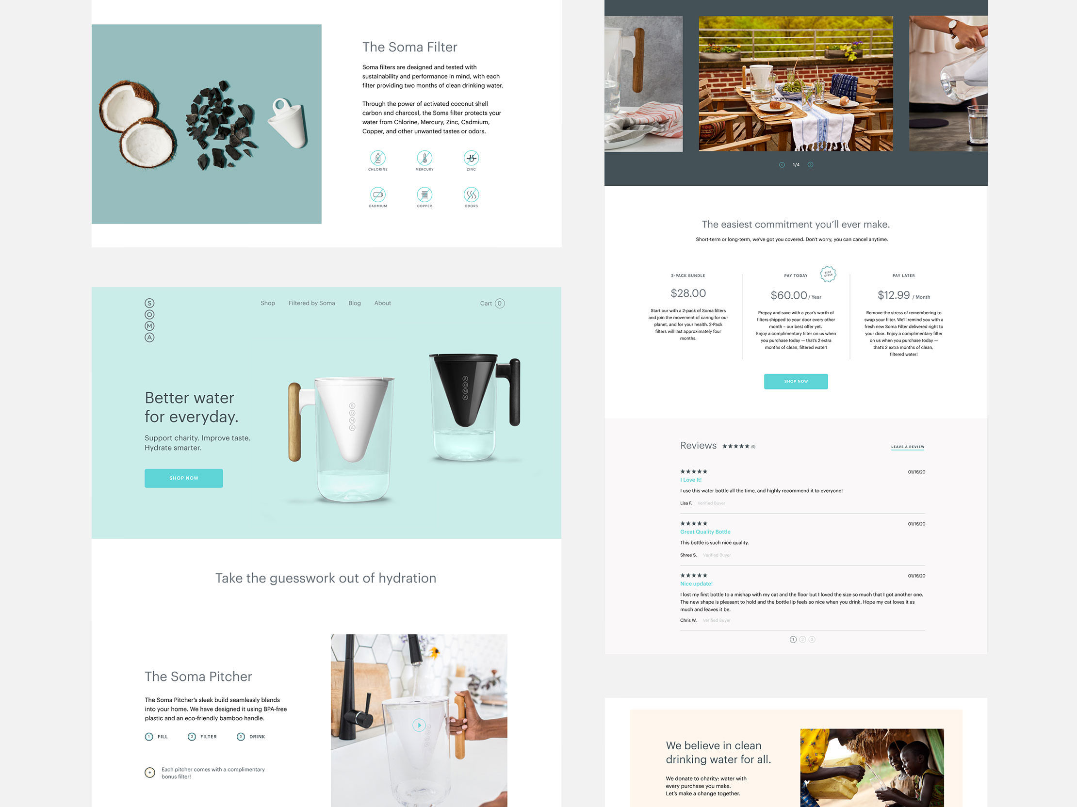
New refreshing Homepage
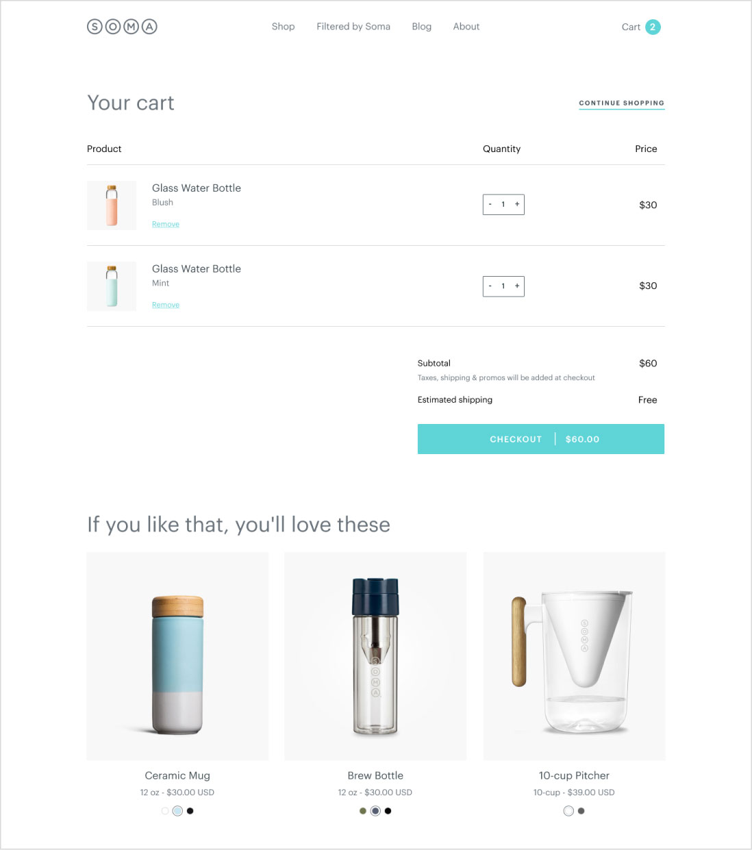
The main objective of the redesign was to focus more on the purchase path in order to convert more. We came with various ideas to present their products and get direct access to the product pages. We designed a dynamic homepage creating clean sections and using carousels, hero images, distinct column layout or even background color to create contrast. We also highlighted their partnership with an organization.
We refreshed the color palette of their style guide to make the site welcoming and even friendlier as well as designed a new iconography specific to the brand.
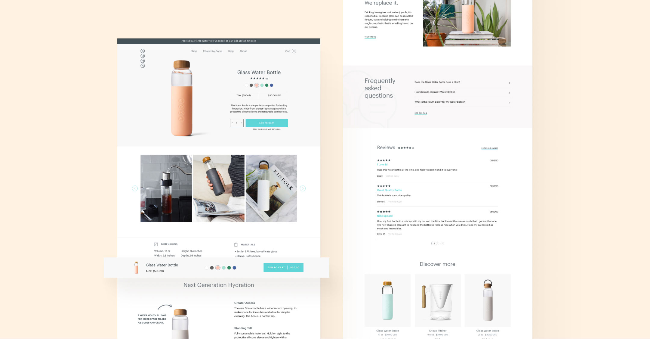
A carefully thought-out Product detail page
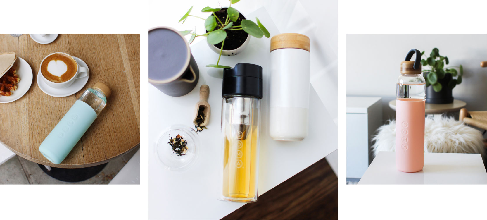
A key element of the website redesign was the product detail page, to showcase design, colors and in-use images of the product. The new product detail page clearly displays variant color, various lifestyle images, specifics about the design, reviews and cross-sell products.
As the product detail page contains a lot of information for the customer, we added a sticky product bar at the bottom of the page to drive conversion while the user is scrolling.
