Four Reasons 
Services
Art Direction
UX/UI
E-commerce Shopify
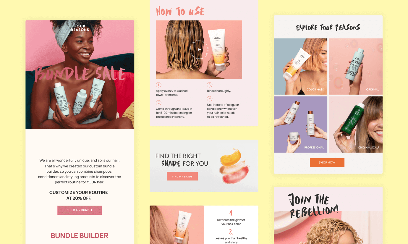
Marketing emails
Four Reasons is a Finnish beauty industry that stands up for diversity. Their goal is to help everyone to feel great by just being themselves. We imagined a new shopping experience around their new brand identity.visit website
We love the real you
The Four Reasons team came to me for a refresh of their website reflecting their new identity: bold, pink, inclusive, breaking the narrow mold of beauty, one better hair day at a time. Cultivating the idea that everyone has their own uniqueness, they encourage everyone to appreciate themselves as they are and offer tools for creating a positive self-image.
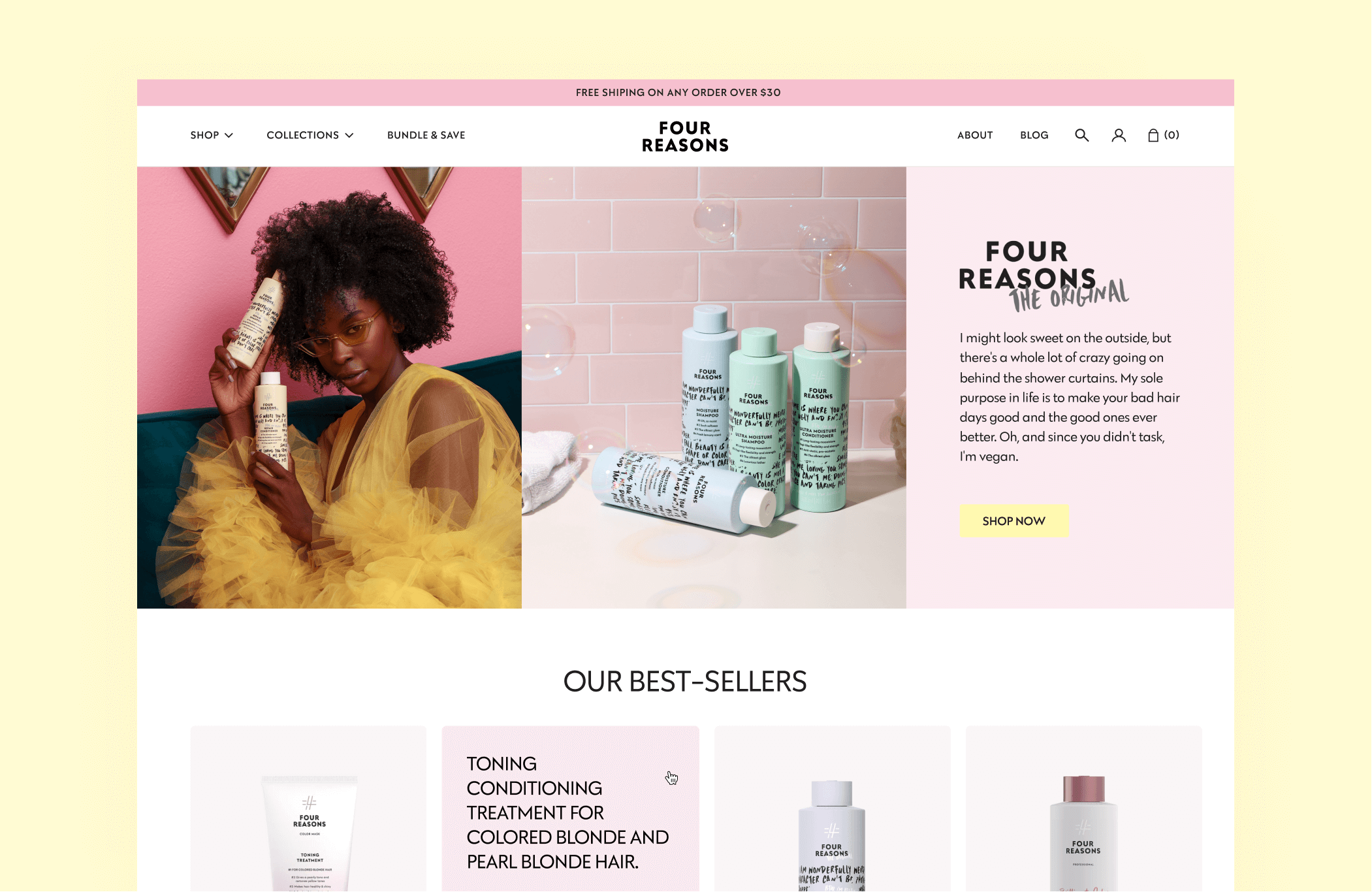
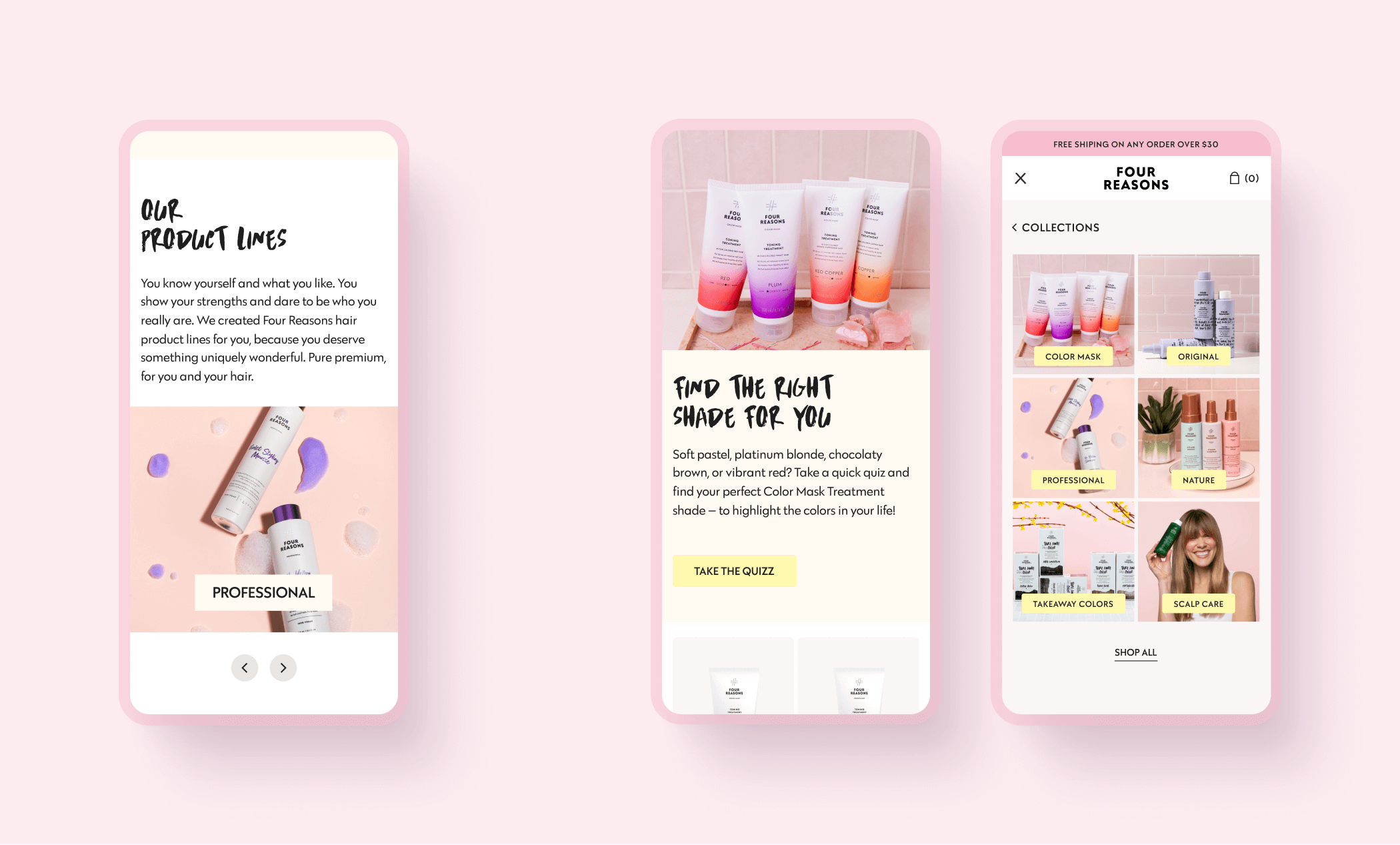
One of the main objective was to simplify the shopping experience and guide the customer across the different products without getting lost by the different collections.
Keeping this in mind, we designed the new homepage giving with direct access to product pages. We also introduced tags on product cards and an overview of the value/benefit of the product while hovering the card so it’s easier to choose through the different products of the different collection.
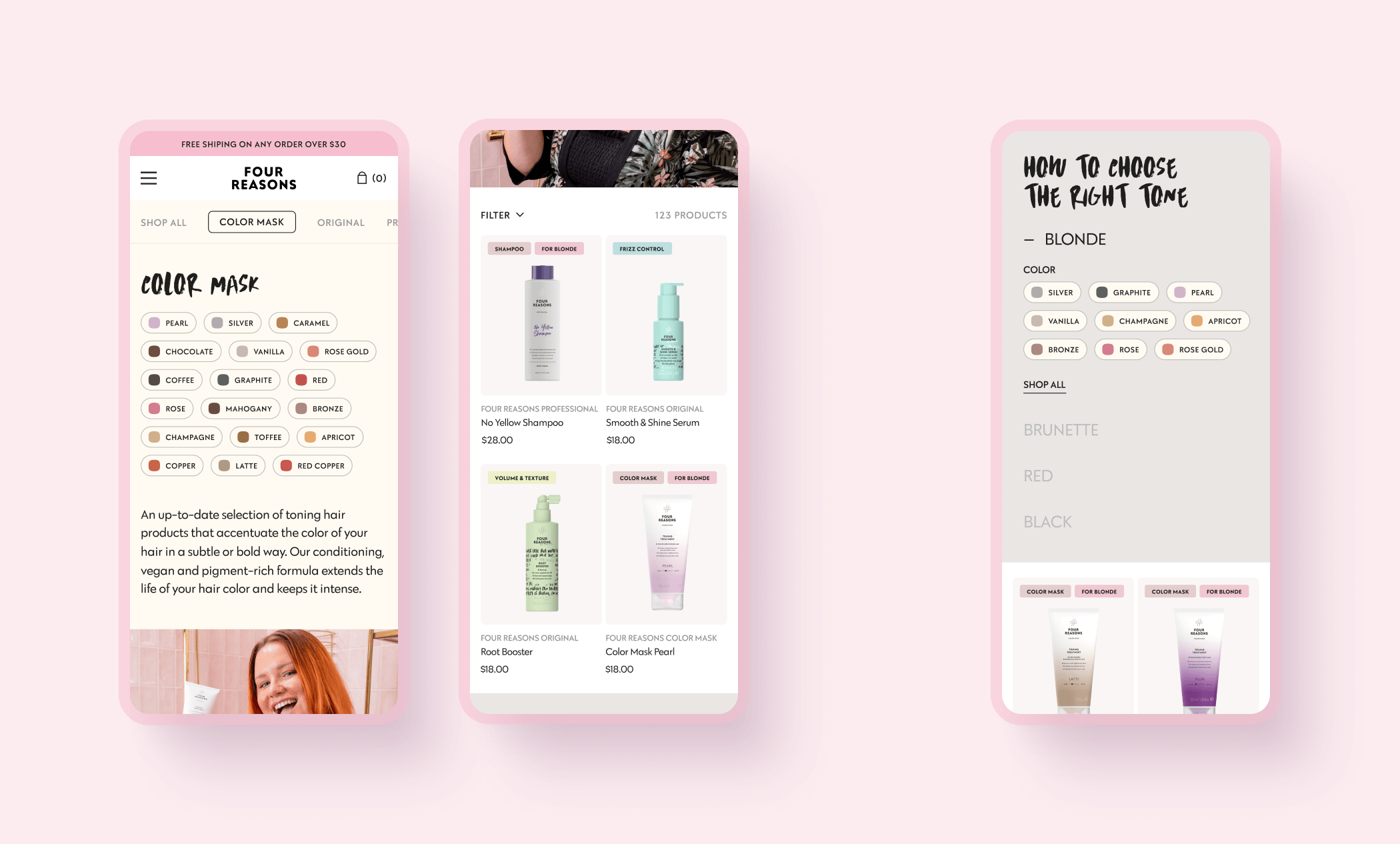
How to choose the right tone
To help customers make the right choice choosing their color mask, we created this module into the collection page to guide them during their shopping.
“Chloe has been a fantastic asset to our brand! She fully understands our brand, and her work reflects her expertise in branding and digital design. Chloe's attention to detail is remarkable, and after 3 years of working with her, she still manages to wow us with her designs.
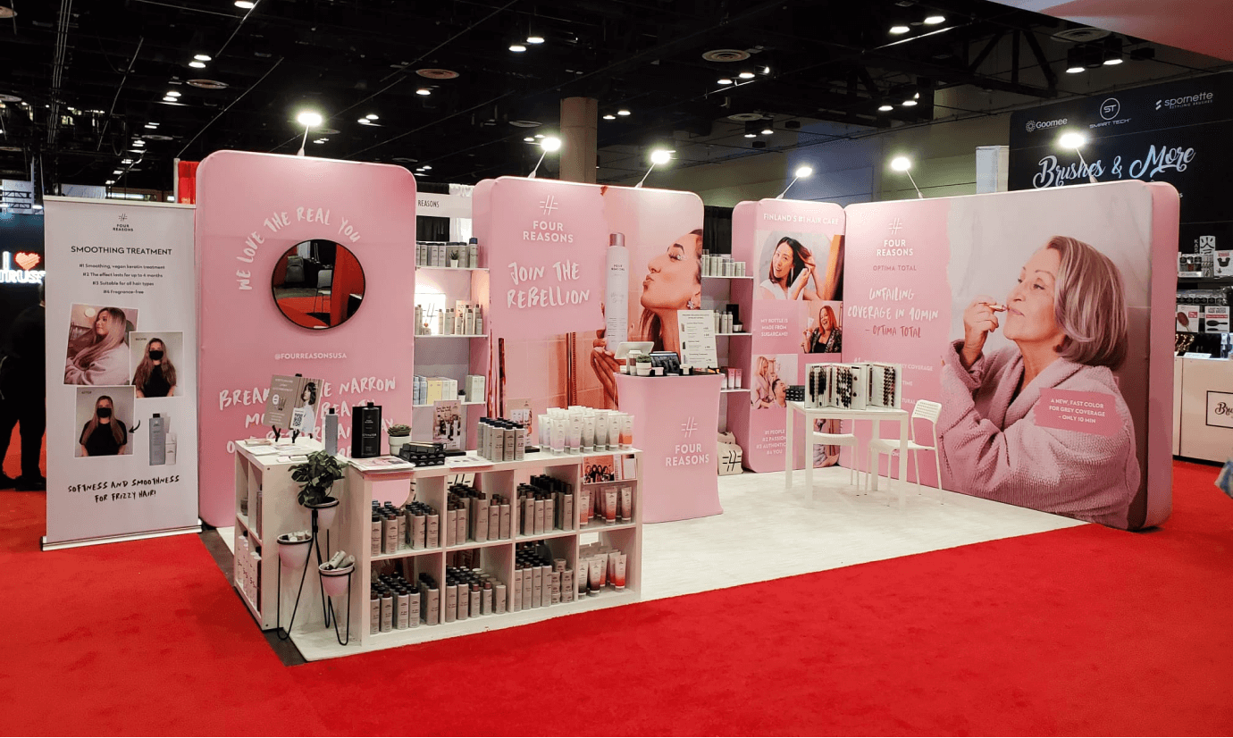
Chloe has designed our websites, emails, banners and other marketing materials, even our trade show booth, which was a huge hit. Chloe has great communication and she is pleasant to work with.”

Sophia Hyökyvaara
Owner at Four Reasons USA
Marketing materials
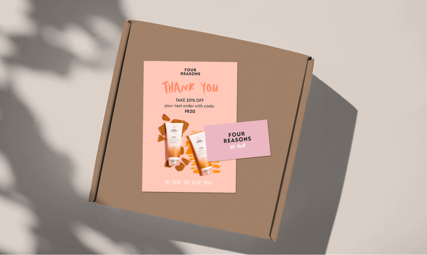
Partnering with the Four Reasons team for over 3 years, I helped them create marketing emails, from automated flows to bi-monthly campaigns as well as various print and digital materials like their trade show booth and insert cards added to each order.
